Fairmount’s Brand Identity Through Time
Fairmount has a brand new look! We are excited to share with you a new logo and overall image that encapsulates the essence of what we strive to do here every day. This playful, whimsical, and colorful new brand identity reflects our rich history, encompasses our creative present, and is a driving force forward into a bright future!
Throughout the process of creating this new look, we took a walk through history and created a timeline of past Fairmount logos.
When Fairmount opened in 1971, it was Fairmount Center for Creative & Performing Arts (fun fact, that is still our legal name!). This sketch of our iconic Novelty building appeared on season schedules and production programs.
Circa 1975, a new logo with an intertwining “F” and “C” was introduced. At this time, Fairmount also operated at a second location, the Coventry Village library building in Cleveland Heights. With help from the Cleveland Foundation, the building was renovated and housed Fairmount arts programs including the Fairmount Theatre for the Deaf.
In 1979, financial issues led to a decision to consolidate operating locations to the original Novelty building.
In 1985, Fairmount started offering gymnastics, karate, and fencing classes on top of its dance, theatre, and visual arts offerings. Gymnastics quickly outgrew Fairmount’s Novelty studios and was moved to the Chagrin Falls Armory in 1987 and then to the old Rich Plan Building in 1992. During this time, gymnastics rose to be Fairmount’s highest revenue source!
In 1990, the center changed its name to Fairmount Fine Arts Center. This photo from 1996 showcases a group of Fairmount dancers posing with a sign reflecting the name and branding at the time.
In 2001, the Spring catalog continued to promote gymnastics as well as music lessons at the Church of the Western Reserve. A partnership with the “new Cleveland School of Dance” was also advertised.
(Yet another fun fact: Music education was not an offering that Fairmount was founded upon. It wasn’t until 1993 that Fairmount started to offer private music lessons first at Riverview Church and then at Church of the Western Reserve. Now, Fairmount’s music lessons are held at its Novelty and Chardon locations and has nearly 100 students enrolled!)
In the early 2000s, Fairmount returned to its original name and iconic building as its brand identity. During this time, classes in creative writing were added.
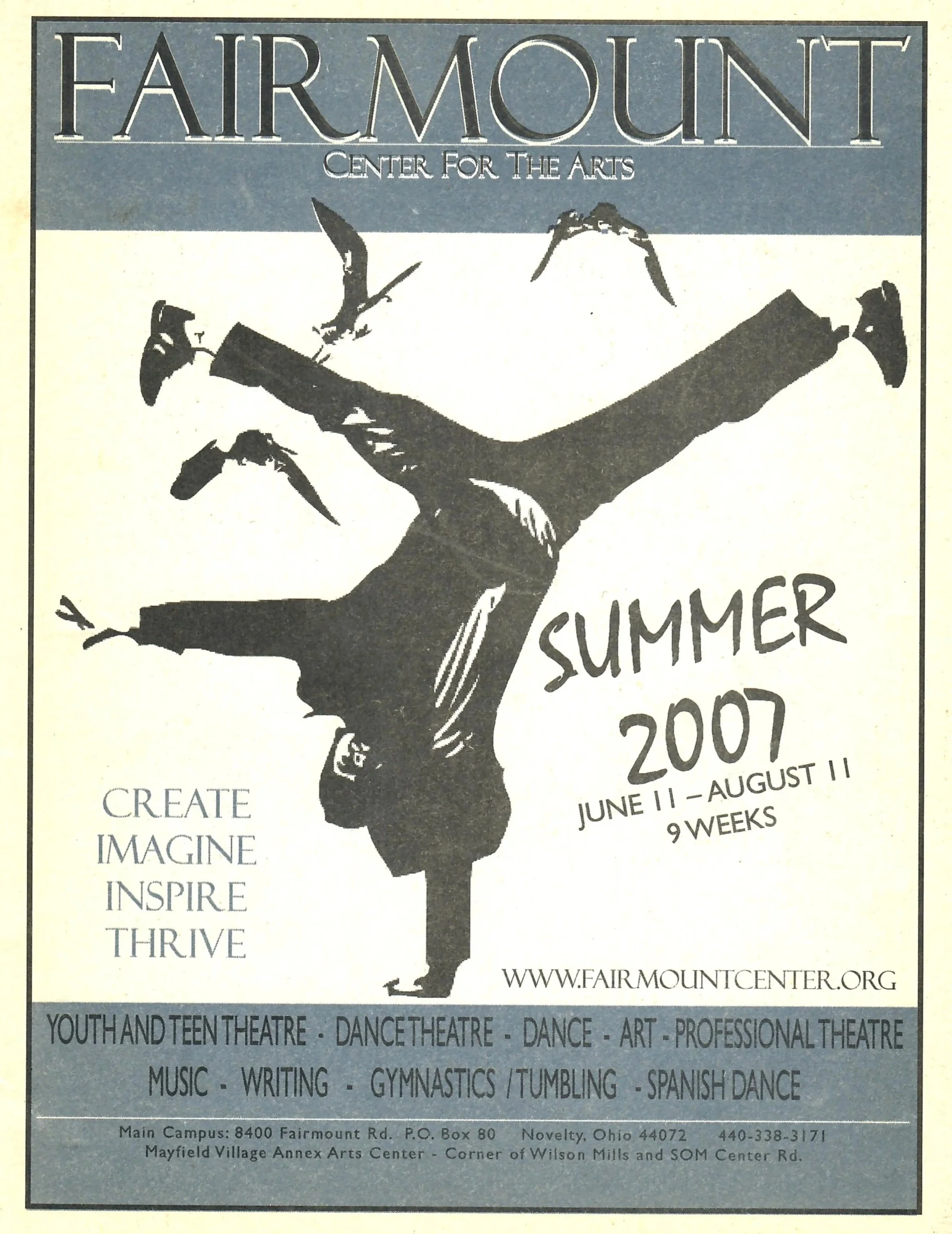
Starting in 2007, the name “Fairmount Center for the Arts” made an appearance on the cover of a summer program. This catalog cover image seen below was used for several years, and in 2010, a very close rendition of our latest logo was first used.
When printed in color, the letters in the word “CENTER” were the colors of the rainbow; red, orange, yellow, green, blue, and purple. Can you think of a place where this logo can be found at Fairmount’s Novelty location?
In 2020 the most recent rendition of our logo, with the letters of the word “Fairmount” in the colors of the rainbow, was first introduced on the cover of the Winter/Spring catalog. The tag line, “Enriching lives through the arts” was also added emphasizing our mission in the community.
And here we are today! With the celebration of our 55th anniversary, a brand refresh with a refined color palette, a more modern font, and a whimsical feel felt right. We hope you join us in celebrating this exciting time at Fairmount!


